

Advertisement
By IS Team
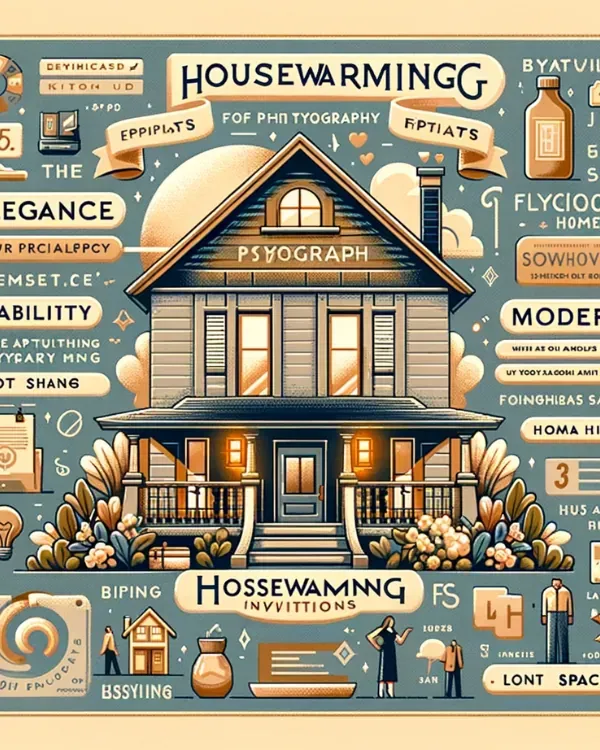
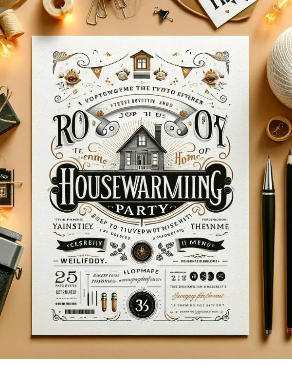
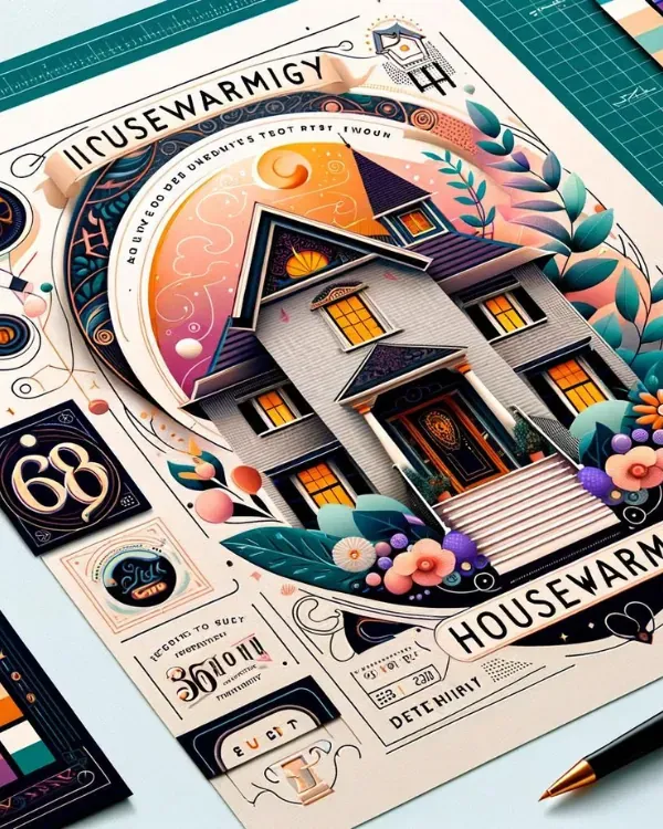
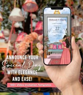
The Role of Typography in Crafting Stunning Housewarming Invitations

Advertisement
Typography in housewarming invitations is not merely a functional element but a pivotal aspect that shapes the event's ambiance and conveys the host's personality. The selection of font type, whether classic serif or modern sans-serif, sets the invitation's tone, establishing a connection with the theme and mood of the housewarming.
Font size and style play a critical role in creating a visual hierarchy, ensuring key details like the event's date and location are prominent and instantly noticeable. The color of the typography needs to complement the invitation's overall color scheme, enhancing aesthetic appeal and readability.
Effective typography in housewarming invitations involves a delicate balance between style and clarity, where each typographic choice reflects the host's personality and the spirit of the new home, making the invitation not just a mere announcement, but a precursor to the warmth and style of the upcoming gathering.
Understanding the Basics of Typography in Invitations
A. Elements of Typography
Font Type: The selection of a font type is crucial in setting the initial tone of the invitation. For instance, serif fonts like Times New Roman or Garamond convey a classic and formal feel, suitable for traditional housewarming events. On the other hand, sans-serif fonts such as Arial or Helvetica exude a modern and clean vibe, ideal for contemporary gatherings. Script fonts like Brush Script or Lucida Handwriting, provide a personal and intimate touch, reflecting a cozy, homey atmosphere.
Font Size: The size of the font is not just about readability but also about hierarchy and emphasis. For example, larger font sizes can be used for the host's name or the event's main details like date and time, making them instantly noticeable. Smaller sizes can be employed for secondary information such as RSVP instructions or dress code.
Font Style: The style of the font adds layers of meaning and attention. For instance, an italic style can indicate a casual or informal note, such as a personal message from the host. Bold styles are effective for highlighting critical information or for creating headings, making the invitation easy to scan.
Color: The choice of color in typography can greatly influence the overall aesthetic and mood. For example, warm colors like reds or oranges can create a feeling of warmth and excitement, while cooler hues like blues and greens might suggest a more relaxed and open-house style event.
B. The Psychology of Typefaces
Different fonts can evoke a range of emotions and set the tone of the event. Serif fonts, traditionally used in print, are often associated with reliability and respectability, making them a great choice for a formal housewarming. In contrast, sans-serif fonts offer a clean and modern look, perfect for a contemporary or minimalist-themed event.
For example, a housewarming invitation using a font like Baskerville can suggest an elegant and traditional event, whereas using a font like Futura might indicate a modern and chic gathering. It’s essential to choose a font that not only matches the theme of the housewarming but also resonates with the host's personal style.
C. Readability and Legibility
Ensuring that the invitation is readable and legible is paramount. This means considering not just the choice of font but also factors like contrast between text and background. For instance, dark text on a light background is generally easier to read than light text on a dark background.
The balance between aesthetic appeal and practical functionality cannot be overstated. An intricately designed font might look beautiful but could be challenging to read if used for all the text on the invitation. Therefore, it might be more effective to use such a font for the names or main heading, while opting for a simpler, more legible font for the details.
Additionally, the spacing between letters (kerning) and lines (leading) is crucial in enhancing readability. Too little space can make the text look cramped and difficult to read, while too much space can disjoint the text and disrupt the flow of reading.
The Role of Typography in Invitation Design
Advertisement
A. Setting the Tone and Atmosphere
- Typography can set the mood, from casual and welcoming to formal and elegant.
- Examples of typefaces include Caslon for a classic feel or Helvetica for a modern vibe.
B. Reflecting the Personality of the Host
- Personalization through font choices makes the invitation unique.
The typography should mirror the host's style and the theme of their new home.
C. Typography as a Visual Focal Point
- Hierarchy of information is achieved through varying font sizes and styles.
Strategic typography draws attention to key details like date and location.
Integrating Typography with Other Design Elements
Advertisement
A. Harmony with Graphics and Colors
Complementary Design: Choose fonts that complement the invitation's graphics and color scheme. For instance, a sleek sans-serif font enhances modern geometric designs, while a classic serif matches well with traditional floral patterns.
Color Coordination: Typography color should contrast and harmonize with the invitation’s colors. A dark font on a light pastel background ensures readability and aesthetic appeal.
Balance in Design: The weight and style of the font should balance the overall design. Avoid heavy fonts overpowering delicate graphics or vice versa.
B. The Interplay of Text and Space
White Space Utilization: Use white space effectively to make the invitation look uncluttered and to emphasize key information. This space around text elements makes the details stand out.
Spacing for Readability: Adjust the spacing between letters and lines for clear readability. Proper kerning prevents text from appearing too cramped, and appropriate leading ensures a smooth flow of text.
Text and Graphic Alignment: Position text thoughtfully in relation to graphics. Text over a busy background may require a simpler font, while more decorative fonts can be used alongside less intricate graphics.
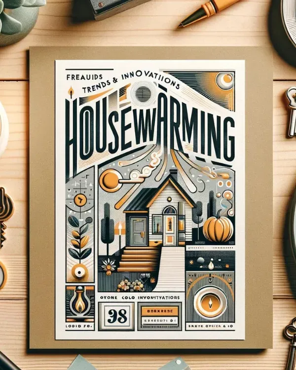
Trends and Innovations in Typography for Invitations
A. Emerging Typography Trends in Invitation Design
Contemporary designs often feature minimalist fonts or unique hand-lettered styles.
Innovative treatments like mixed typography or dimensional lettering are gaining popularity.
B. Digital Typography in E-Invitations
Digital formats have expanded typographic possibilities, including animation and interactive elements.
E-invitations often feature animated or interactive text, adding a dynamic layer to the invitation experience.
Practical Tips for Choosing Typography in Housewarming Invitations
Advertisement
A. Guidelines for Selecting the Right Typeface
Consider the Event's Formality, Home's Style, and Desired Mood: Align the font with the tone of the event. A formal gathering might call for a more elegant font, whereas a casual get-together can use a relaxed typeface.
Test Legibility at Various Sizes and on Different Mediums: Ensure the font is readable on both print and digital platforms, and is clear in both small and large sizes.
Match with Theme Elements: If your housewarming has a specific theme (e.g., vintage, rustic, modern), the font should complement this theme. For instance, a vintage theme might suit a script font.
Consider Cultural Sensitivities: Be mindful of cultural contexts and traditions, especially if your guest list is diverse. Certain fonts might resonate more culturally and add a personal touch.
B. Common Mistakes to Avoid in Typography
Overcrowding with Too Many Font Styles: Stick to a maximum of two or three font styles to maintain visual coherence and avoid confusion.
Using Hard-to-Read Fonts or Colors that Clash with the Design: Prioritize legibility and ensure a harmonious color scheme that complements the invitation's overall design.
Ignoring Contrast: Ensure there is enough contrast between the text color and the background. Insufficient contrast can make the text difficult to read.
Overlooking the Importance of Mood: The chosen font should reflect the mood of the housewarming. A mismatched font can convey an unintended tone, like using a too formal font for a casual gathering.
Advertisement
What Are You Looking For?
Advertisement
I'm Looking For!
Get personalized digital invitations for
weddings, birthdays, and special events.
Unique designs, quality, and exceptional
service to make your celebrations
unforgettable.
Get personalized digital invitations for
weddings, birthdays, and special events.
Unique designs, quality, and exceptional
service to make your celebrations
unforgettable.
Quick Links
Customer Service
Creative Invitation Guides
Supports & Social Media

Get personalized digital invitations for weddings, birthdays, and special events. Unique designs, quality, and exceptional service to make your celebrations unforgettable.
Quick Links
+Customer Service
+Creative Invitation Guides
+CONTACT US
+