

Advertisement
By IS Team
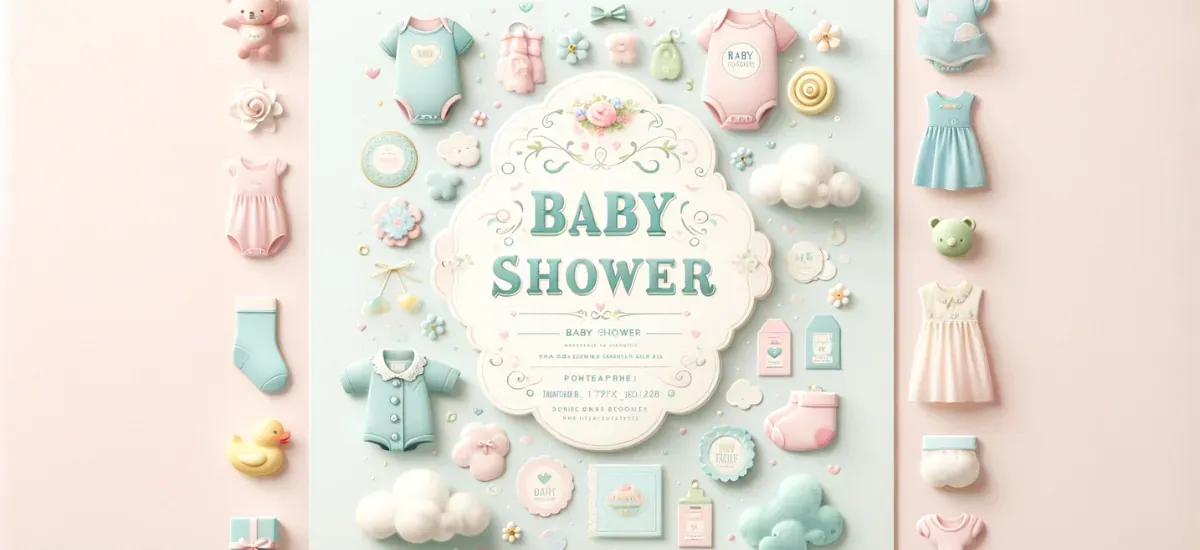
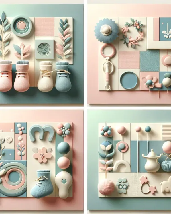
Pastel Baby Shower Invitation
Advertisement
Baby showers are a time-honored tradition, celebrating the impending arrival of a new life. Invitations are not just a formality; they set the tone for this joyous occasion. They are the first glimpse guests have into this special day, making their design and theme crucial.
Pastel themes, known for their soft and soothing hues, are increasingly popular for baby showers. They offer a delicate balance of elegance and cheerfulness, perfect for welcoming a new baby.
Popular Pastel Colors in Baby Showers
Advertisement
In the realm of baby showers, certain pastel shades stand out for their softness and symbolism:
Soft Pink: A classic choice, soft pink represents tenderness and love, making it a perennial favorite for baby girls.
Baby Blue: Evocative of the sky, baby blue is often associated with tranquility and is a popular choice for baby boys.
Mint Green: This refreshing shade brings a sense of freshness and vitality, suitable for any gender.
Lavender: A hint of elegance and grace, lavender is a sophisticated yet gentle choice that works well for all babies.
Overview of Trending Pastel Color Combinations
Trending pastel color combinations often blend traditional and contemporary elements. Some popular schemes include:
Peach and Soft Green: A harmonious blend that is both warm and refreshing.
Lilac and Cream: This combination offers a delicate balance, perfect for a sophisticated, modern look.
Pale Yellow and Sky Blue: A cheerful duo that brings a sunny, optimistic vibe.
Gender-Neutral Pastel Palettes
Advertisement
Gender-neutral palettes are increasingly popular, reflecting a more inclusive approach to celebrating new life. These palettes often include:
Soft Grey and Pale Yellow: A chic and contemporary combination.
Beige and Seafoam Green: Earthy yet whimsical, perfect for a natural, understated elegance.
Dusty Blue and Muted Coral: A unique pairing that is both modern and timeless.
The Psychological Impact
Pastel colors play a significant role in setting the mood for a baby shower. Their psychological impact is profound:
Calming Effect: Pastels are known to have a calming effect, creating a peaceful and serene environment.
Sense of Innocence: These colors often symbolize purity and innocence, resonating with the essence of a newborn.
Welcoming Atmosphere: The softness of pastels creates a welcoming and warm atmosphere, ideal for gatherings that celebrate new beginnings.
Incorporating pastel colors into a baby shower not only enhances the aesthetic appeal but also contributes to an environment filled with love, joy, and anticipation for the new life.
Design Principles with Pastel Colors
Balancing Pastel Colors in Design
Achieving the right balance with pastel colors is key to creating an inviting and harmonious design. Here are some tips:
Mix and Match: Combine different pastel shades to add depth and interest. For instance, pairing a soft lavender with a muted mint green can create a delightful contrast.
Avoid Overuse: Too many pastel colors can make a design look washed out. Limit the palette to two or three main colors for clarity and impact.
Use of White Space: Incorporating ample white space can prevent the design from feeling overcrowded and helps the pastel colors stand out more vividly.
Complementary Colors and Contrasts with Pastels
Advertisement
Pastels can be beautifully complemented by other colors:
Contrasting Hues: Pairing pastels with darker or more saturated colors can create a visually appealing contrast. For example, a deep navy blue can make a soft peach pop.
Neutral Tones: Neutral colors like grey, beige, or cream can serve as a perfect backdrop, allowing pastel colors to shine without overpowering the design.
Metallic Accents: Adding metallic elements like gold or silver can bring a touch of elegance and sophistication to a pastel-based design.
Incorporating Themes with Pastel Colors
Integrating Popular Baby Shower Themes with Pastels
Pastel colors offer a versatile palette for various baby shower themes. Here's how they can be integrated:
Safari Theme: For a safari-themed baby shower, use soft shades of green, yellow, and brown. Illustrations of gentle animals in pastel tones can add charm and playfulness.
Watercolor Theme: Watercolor themes work beautifully with pastels. Soft, flowing watercolor backgrounds in pastel hues can create an ethereal and dreamy atmosphere.
Floral Theme: Floral themes are a natural fit for pastels. Soft pinks, lavenders, and yellows can be used to depict delicate flowers, creating a garden-like, serene setting.
Pastel Color Trends in Baby Showers
Current trends in pastel colors for baby showers include:
Gender-Neutral Themes: Moving away from traditional pink and blue, gender-neutral themes in pastels are gaining popularity. Colors like pale yellow, soft green, and lavender are excellent choices.
Modern Pastel Combinations: Contemporary themes often mix pastels with bold or neutral colors. For example, a combination of pastel pink with grey can create a modern yet soft look.
Vintage Pastels: Vintage themes with muted pastel tones like dusty rose or sage green are becoming popular, offering a nostalgic and elegant feel.
Combining Traditional and Modern Elements with Pastels
Advertisement
Blending traditional and modern elements with pastels can create a unique and stylish baby shower theme:
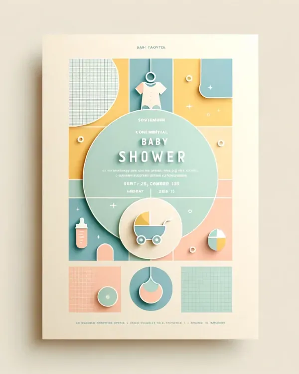
Classic Meets Contemporary: Combine classic pastel shades with modern design elements, like geometric shapes or minimalist layouts, for a fresh take on tradition.
Textural Contrasts: Mix textures, such as lace (traditional) with sleek paper (modern), to add depth to the pastel theme.
Innovative Invitations: Use traditional pastel colors in innovative invitation designs, like digital e-vites or invitations with interactive elements, to blend the old with the new.
Design Elements of Pastel Baby Shower Invitations
Key Design Components
When designing pastel baby shower invitations, two critical elements come into play: typography and imagery. These components must harmonize with the pastel theme to create an invitation that is both aesthetically pleasing and functional.
Typography
Font Selection: The choice of font can significantly impact the invitation's overall feel. Script fonts, with their elegant curves, complement the softness of pastels and add a touch of sophistication. For a more contemporary look, sans-serif fonts provide a clean, modern appeal. The key is to match the font style with the invitation's tone and theme.
Color of Text: Selecting the right color for the text is crucial for readability. Against pastel backgrounds, opt for darker hues or contrasting shades to ensure the text stands out. For instance, charcoal grey or navy blue can be more readable than black on a light pastel background.
Hierarchy and Layout: The arrangement of text plays a vital role in the invitation's readability and aesthetic appeal. Important information like the date and location should be prominent. Utilize varying font sizes and weights to create a visual hierarchy, guiding the reader's eye through the invitation in a logical and pleasing manner.
Imagery
Incorporating Pastel Shades in Images: When including images, adjust their color balance to align with the pastel theme. This could mean softening the colors or applying a pastel filter to ensure they blend seamlessly with the overall design.
Balance and Composition: The imagery should enhance, not overpower, the invitation. Strive for a balance where images complement the text and other design elements. For instance, a delicate floral border in pastel shades can frame the invitation's content without overwhelming it.
Incorporating Pastel Colors into Various Design Elements
Backgrounds and Borders
Solid vs. Gradient Backgrounds
Solid Pastel Backgrounds: A solid pastel background offers a clean and simple canvas, bringing a sense of calm and focus to the invitation. It's ideal for highlighting the text and other key elements without any distractions.
Subtle Gradient Backgrounds: Gradients can add depth and a contemporary feel to the invitation. A gentle transition from one pastel shade to another, such as from baby pink to soft lavender, can create a visually appealing and dynamic background without being overpowering.
Decorative Borders
Pastel Shades and Patterns: Borders designed with pastel shades or patterns can frame the content of the invitation, adding a decorative touch. For instance, a scalloped border in a soft blue or a floral pattern in pastel hues can enhance the invitation's overall aesthetic.
Thematic Borders: For themed baby showers, borders can reflect the theme while using pastel colors. A safari theme, for example, could have a border with pastel-colored animal silhouettes.
Decorative Elements
Patterns and Textures
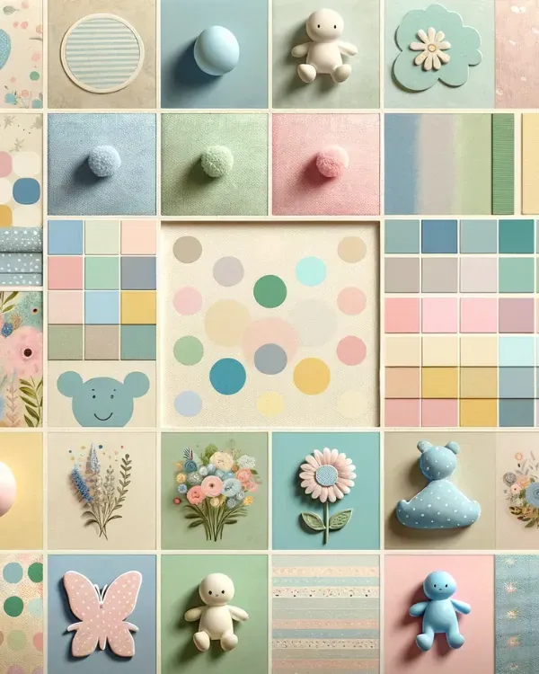
Pastel Patterns: Incorporating patterns like stripes, polka dots, or floral designs in pastel colors can add a playful yet elegant element to the invitation. These patterns should be used judiciously to maintain the design's overall softness.
Textures: Adding textures such as a watercolor effect or a paper grain look can give the invitation a tactile feel, even if it's digital. These textures in pastel tones can enhance the invitation's visual appeal without being too bold.
Icons and Symbols
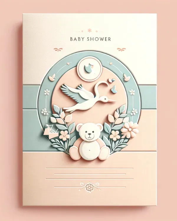
Pastel-Colored Icons: Using icons or symbols relevant to baby showers, such as storks, pacifiers, or baby bottles, in pastel colors can add a thematic and whimsical touch. These should be used subtly to complement the invitation's overall design.
Symbol Placement: The placement of these icons should be strategic, ensuring they add to the design's charm without cluttering it. For example, a small pastel stork icon in the corner or a border of pacifiers in a soft hue can be delightful additions.
Innovative Pastel Invitation Ideas
Creative and Unique Designs
Layered Invitations: Create a multi-dimensional effect by layering different pastel shades, each layer revealing a part of the invitation.
Interactive Elements: Incorporate interactive elements like pull-tabs or rotating wheels in pastel colors, adding an element of surprise and engagement.
Pop-up Features: Design invitations with pop-up pastel elements, such as a three-dimensional stork or baby carriage, to add a whimsical touch.
Textures and Embellishments
Embossed Details: Use embossing techniques to add texture to pastel elements, giving a luxurious feel to the invitation.
Ribbon and Lace: Adorn invitations with ribbons or lace in pastel shades for a delicate, tactile element.
Glitter and Metallic Accents: Introduce subtle glitter or metallic accents in gold or silver to complement the pastel tones and add a hint of sparkle.
Digital vs. Physical Pastel Invitations
Designing for Different Formats
| Aspect | Digital Invitations | Physical Invitations |
|---|---|---|
| Color Accuracy | Use color calibration tools to ensure accuracy across different digital screens. | Choose high-quality paper that accurately reflects pastel shades. |
| Material Quality | N/A (as it's digital) | Select premium paper that enhances the appearance of pastel colors. |
| Texture and Feel | Not applicable, as digital invitations do not have a tactile element. | Consider the texture of the paper, which can add a luxurious feel to the invitation. |
| Cost and Accessibility | Generally more cost-effective and easily accessible | Typically more expensive, considering printing and material costs. |
| Environmental Impact | Lower environmental impact due to lack of physical materials | Higher environmental impact, especially if using non-recycled paper. |
This table provides a comprehensive comparison of digital and physical pastel invitations, considering aspects like color accuracy, material quality, texture, cost, and environmental impact.
Tips for Both Mediums
Consistent Design Elements: Ensure design elements like fonts and graphics are consistent across both digital and physical formats.
Test and Preview: Preview the design in both formats to ensure the colors and layout appear as intended.
Incorporating Pastel Themes into Other Baby Shower Aspects
Extending the Theme Beyond Invitations
Decorations: Use pastel-colored streamers, balloons, and tableware to create a cohesive look throughout the event space.
Floral Arrangements: Choose flowers in pastel hues to complement the theme, such as soft pink roses or lavender.
Lighting: Soft, ambient lighting can enhance the pastel theme, creating a warm and inviting atmosphere.
Coordinating with the Overall Theme
Dress Code: Suggest a pastel dress code for guests to fully immerse them in the theme.
Consistent Color Palette: Ensure that the colors used in the invitations are reflected in the decorations, dress code, and other aspects of the baby shower.
Thematic Elements: If the invitation features specific elements like animals or flowers, echo these in the decorations and cake design for a unified theme.
Frequently Asked Question
Q1: Why choose pastel colors for a baby shower invitation?
Answer: Pastel colors are chosen for their calming effect, association with innocence, and ability to create a warm and welcoming atmosphere, aligning perfectly with the celebration of a new life.
Q2: What are popular pastel color combinations for baby shower invitations?
Answer: Trending combinations include Peach and Soft Green, Lilac and Cream, and Pale Yellow and Sky Blue, each offering a unique blend of warmth and elegance.
Q3: How can pastel colors be balanced in a baby shower invitation design?
Answer: Achieve balance by mixing and matching pastel shades, avoiding overuse, incorporating white space, and considering complementary colors and contrasts to enhance the overall design.
Q4: What role do pastel colors play in the psychological impact of a baby shower?
Answer: Pastel colors contribute to a calming atmosphere, symbolize innocence, and create a welcoming environment, fostering a sense of love and joy for the upcoming arrival.
Q5: How can pastel colors be incorporated into different design elements of a baby shower invitation?
Answer: Pastel colors can be introduced through backgrounds, borders, decorative elements, and imagery, with tips on achieving balance, utilizing patterns and textures, and selecting the right materials for print or digital formats.
Conclusion
Designing a baby shower invitation is a journey of creativity and love. Pastel colors offer a canvas to express the joy and anticipation of welcoming a new life. This guide aims to inspire and assist in creating an invitation that not only announces but celebrates this momentous occasion.
Advertisement
What Are You Looking For?
Advertisement
I'm Looking For!
Get personalized digital invitations for
weddings, birthdays, and special events.
Unique designs, quality, and exceptional
service to make your celebrations
unforgettable.
Get personalized digital invitations for
weddings, birthdays, and special events.
Unique designs, quality, and exceptional
service to make your celebrations
unforgettable.
Quick Links
Customer Service
Creative Invitation Guides
Supports & Social Media

Get personalized digital invitations for weddings, birthdays, and special events. Unique designs, quality, and exceptional service to make your celebrations unforgettable.
Quick Links
+Customer Service
+Creative Invitation Guides
+CONTACT US
+