

Advertisement
By IS Team
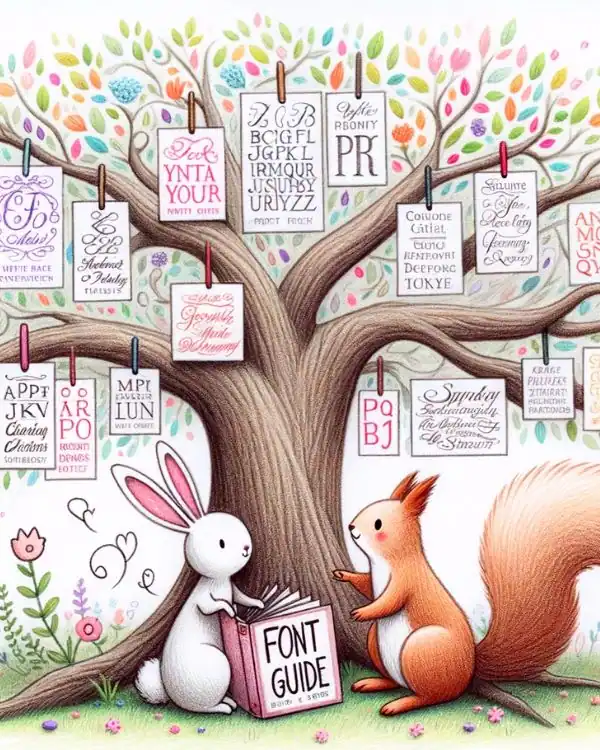
The Ultimate Font Guide For Wedding Invitations: Tips From A 15-Year Veteran

Advertisement
The Secret Language of Invitation Fonts: A Masterclass in Typography for Wedding Invitations
If you think choosing a font for a wedding invitation is as simple as picking something "pretty," you're in for a revelation. The font you select is not just typography; it's a form of expression, a nuanced language that speaks volumes about the event and the couple getting married.
With over 15 years in the invitation design industry, I've seen how the right—or wrong—font can make or break an invitation. Let's delve into the intricacies of this subtle art form.
Section 1: The Secret Language of Invitation Fonts
Why Font Matters: It's Not Just Aesthetics
Advertisement
Let's get this straight: the font you choose is the linchpin of your design. It's not just about "looking good." It's about readability, emotional impact, and thematic coherence. A well-chosen font can elevate a simple invitation into a keepsake, while a poorly chosen one can turn even the most beautiful design into an unreadable mess.
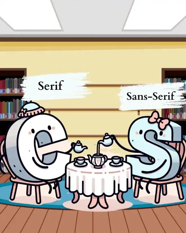
Serif vs. Sans-Serif: The Eternal Debate Resolved
Advertisement
You've probably heard the terms "Serif" and "Sans-Serif" thrown around. But do you truly understand the weight these categories carry in the realm of wedding invitations?
Table: The Unspoken Rules of Serif and Sans-Serif in Wedding Invitations
| Font Type | When to Use | When to Avoid |
|---|---|---|
| Serif | Formal, Traditional Weddings | Casual, Modern Themes |
| Sans-Serif | Modern, Minimalist Weddings | When Elegance is Key |
The Elegance of Script: When and How to Use It
Script fonts are the crown jewels of wedding typography, but they are also the most misused. A well-placed script can evoke romance and luxury. However, overuse or improper pairing can make your invitation look like a parody of itself.
Expert Tip: When using script fonts, always print a test invitation. What looks readable on a screen may not be as clear in print, especially with more intricate script fonts.
The Modernist's Dilemma: Clean Lines vs. Sterility
Advertisement
Modern, minimalist designs often lean on sans-serif fonts like Arial or Helvetica. But beware—the line between "clean" and "sterile" is a fine one. A modern font can convey sophistication, but it can also come off as impersonal if not handled with care.
Expert Tip: When using modern fonts, consider the paper texture. A textured paper can add a touch of warmth to a modern, clean design.
The Quirky Quandary: Making a Statement Without Becoming a Joke
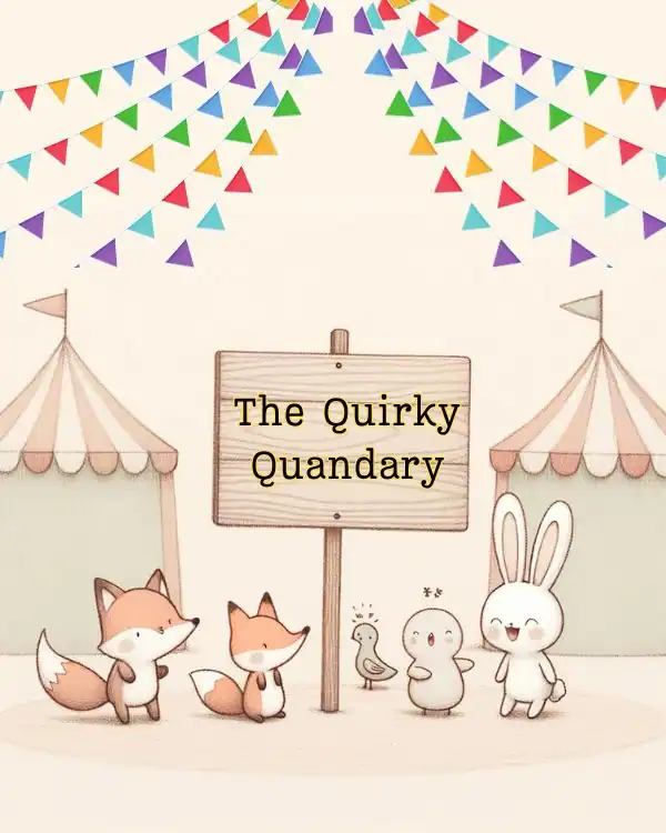
Novelty fonts like Comic Sans or Jokerman can be tempting when you're looking to make a bold statement. But tread carefully. These fonts can quickly turn your invitation from unique to ridiculous, overshadowing the significance of the occasion.
Expert Tip: If you're tempted to use a quirky font, limit it to one element of the invitation, like the couple's names or the header. This way, you can make a statement without overwhelming the design.
Section 2: Best Fonts for Wedding Invitations: A Curated List
Top 5 Fonts for Elegance: The Classics Never Fail

When it comes to elegance, some fonts have stood the test of time. Fonts like Baskerville, Caslon, and Garamond are the epitome of classic sophistication.
Table: The Timeless Elegance of Classic Fonts | Font | Ideal For | Expert Tip | |----------|:-------------:|------:| |Baskerville | Formal Weddings | Pair with a subtle metallic ink for an added touch of luxury. | |Caslon | Vintage Themes | Use sparingly in headers; it's a strong font that can overpower. | | Garamond | Romantic Settings | Great for body text; its readability is unparalleled for long paragraphs. |
Expert Hack: To make your elegant fonts pop, consider using letterpress printing. The deep impression on a high-quality paper can make these classic fonts truly shine.
Top 5 Fonts for Readability: Clarity is King
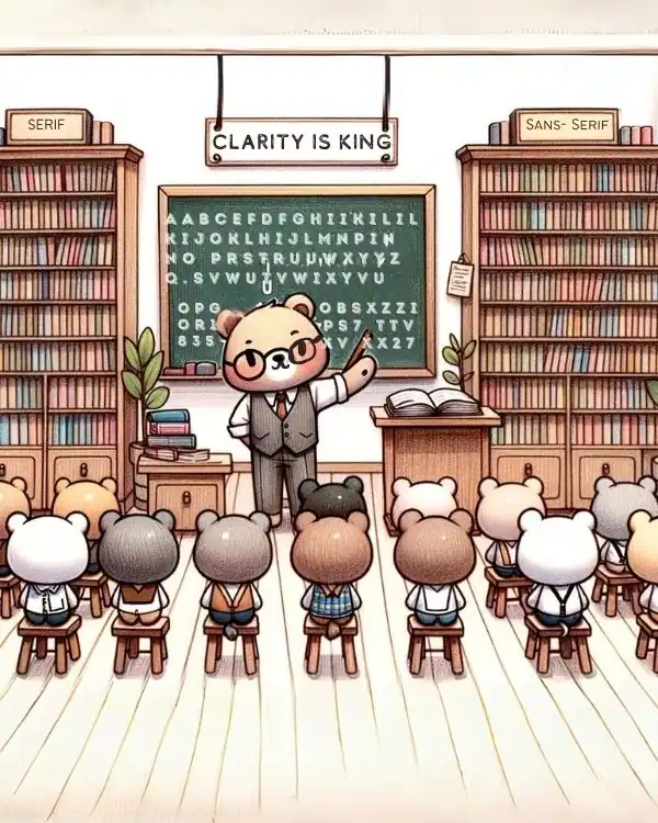
While elegance is crucial, readability is non-negotiable. Fonts like Arial, Verdana, and Calibri ensure that your guests can easily read every detail.
Table: The Unsung Heroes of Readable Fonts | Font | Ideal For | Expert Tip | |----------|:-------------:|------:| |Arial | Modern Weddings | Keep it for body text; too much can make the invite look generic. | |Verdana | Outdoor Themes | Excellent for digital invites; it's designed for screen readability. | | Calibri | Casual Events | Pair with a more decorative header font to add some flair. |
Expert Hack: For digital invitations, use a minimum font size of 16px for body text to ensure mobile readability.
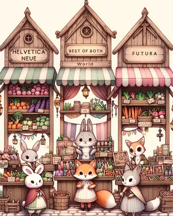
Top 5 Versatile Fonts: The Best of Both Worlds
Advertisement
Some fonts offer the perfect balance between readability and elegance. Fonts like Helvetica Neue and Futura are versatile choices that work in almost any setting.
Table: The Jack-of-All-Trades in Font Selection
| Font | Ideal For | Expert Tip |
|---|---|---|
| Helvetica Neue | Any Setting | Use different weights and styles for a cohesive look. |
| Futura | Modern and Vintage Themes | Excellent for all-caps headers; it adds a touch of modernity. |
Expert Hack: When using versatile fonts, play with letter spacing and line height to give a unique touch to your design.
Conclusion
Choosing the right font for a wedding invitation is an art form that requires a deep understanding of typography, design, and the emotional undertones that fonts can convey. With these expert tips and hacks, you're well-equipped to create an invitation that not only looks stunning but also resonates with the essence of your special day.
Additional Resources
- Top Websites to Download Premium Fonts
- Advanced Typography Courses for Designers
Advertisement
What Are You Looking For?
Advertisement
I'm Looking For!
Get personalized digital invitations for
weddings, birthdays, and special events.
Unique designs, quality, and exceptional
service to make your celebrations
unforgettable.
Get personalized digital invitations for
weddings, birthdays, and special events.
Unique designs, quality, and exceptional
service to make your celebrations
unforgettable.
Quick Links
Customer Service
Creative Invitation Guides
Supports & Social Media

Get personalized digital invitations for weddings, birthdays, and special events. Unique designs, quality, and exceptional service to make your celebrations unforgettable.
Quick Links
+Customer Service
+Creative Invitation Guides
+CONTACT US
+