

Advertisement
By IS Team
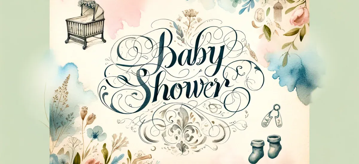
Calligraphy and Typography for Classic Baby Shower Invitations
Advertisement
In the world of invitation design, calligraphy and typography are not just about legibility; they are the art forms that breathe life into your message. These elements do more than convey information; they set the tone, mood, and personality of the baby shower event.
Elegant calligraphy can imbue a sense of tradition and sophistication, while thoughtfully chosen typography can communicate modernity or whimsy, depending on the style. In essence, these are the tools that transform a simple announcement into a memorable keepsake, an artifact that captures the joy and anticipation surrounding the arrival of a new baby.
Understanding the Basics 📖
Distinction between Calligraphy and Typography
| Aspect | Calligraphy | Typography |
|---|---|---|
| Definition | The art of producing decorative handwriting or lettering with a pen or brush. | The art and technique of arranging type to make written language legible, readable, and appealing when displayed. |
| Focus | Individual expression of each letter. | Collective harmony of letters and text blocks. |
| Key Characteristics | Fluid, intentional strokes; varies greatly with the calligrapher's style. | Cohesive, readable, and aesthetically pleasing text arrangement. |
| Personalization | Highly personal and unique. | Less about individual expression, more about overall design |
| Role in Design | Adds a personal touch and artistic flair. | Ensures readability and aesthetic appeal. |
| Importance in Invitations | Provides a unique, handcrafted feel. | Ensures the invitation is legible and visually harmonious. |
Calligraphy for Baby Shower Invitations 🖌️
Advertisement
1. Choosing the Right Calligraphy Style 🌟
When selecting a calligraphy style for your digital baby shower invitations, consider these key points:
Match the Theme: Choose a style that aligns with your baby shower's theme. Opt for elegant scripts for formal events, modern calligraphy for casual gatherings, and playful styles for themed parties.
Ensure Readability: Pick a style that's not only beautiful but also easy to read, especially for important details like date and location.
Experiment and Personalize: Use digital design tools to try out different styles. Select one that resonates with your personal taste and the unique spirit of the occasion.
Seek Inspiration: Look at other baby shower invitations for ideas on how different styles can convey various moods and themes.
By focusing on these aspects, you can choose a calligraphy style that beautifully complements your baby shower while ensuring clarity and a personal touch.
2. Digital Tools for Calligraphy Design 💻✍️
Embrace the digital age! Explore various software and apps designed for digital calligraphy, like Adobe Illustrator or Procreate. These tools offer a plethora of options for brush styles, stroke thickness, and texture, allowing for precision and creativity in your designs.
3. Incorporating Calligraphy into Digital Invitations 💌
To effectively integrate calligraphy into digital baby shower invitations, consider these concise tips:
Highlight Key Details: Use calligraphy for important information like the baby's name, date, and time to draw attention and add a personal touch.
Maintain Balance: Ensure the calligraphy complements the overall design without overwhelming it. It should harmonize with other elements like colors and images.
Consistent Style: Choose a calligraphy style that matches the invitation's theme and color scheme.
Digital Techniques: Utilize layering, adjust transparency, and play with colors using digital tools for a seamless integration.
Consider Spacing: Pay attention to white space and the size and placement of calligraphic text for better readability and visual appeal.
Preview and Adjust: Test the design on different devices and be open to feedback for any necessary adjustments.
By focusing on these key aspects, you can create a digital invitation that beautifully showcases calligraphy while maintaining clarity and aesthetic harmony.
4. Balancing Calligraphy with Other Design Elements ⚖️🎨
Advertisement
Achieve harmony in your design. Balance the flamboyance of calligraphy with simpler fonts for other text elements. Pay attention to spacing, color schemes, and visual hierarchy to create an invitation that's both beautiful and easy to read.
Example of a Balanced Invitation Design:
Imagine a baby shower invitation with the baby's name elegantly written in calligraphy at the top. This calligraphy is in a soft, flowing script, perhaps in a gentle blue or pink, depending on the theme. Below the name, the details of the event (like date, time, and location) are in a simpler, sans-serif font that's easy to read. This font is smaller and in a darker shade, creating a nice contrast without competing with the calligraphy.
The background is a light, neutral color, ensuring the text stands out. There's ample white space around each element, preventing the design from feeling cluttered. A few subtle, thematic graphics – like baby footprints or stars – are placed around the edges, complementing the overall design without overpowering the text.
This layout achieves a harmonious balance, where the calligraphy adds a touch of elegance and personalization, while the simpler fonts and thoughtful design choices ensure clarity and readability.
5. Selecting Colors and Fonts for Digital Calligraphy 🌈🔠
Color and font choice can make or break your design. Opt for colors that match the baby shower's palette. When selecting fonts, consider readability and how well they pair with your chosen calligraphy style.
| Font Type | Description | Ideal Use | Color Considerations |
|---|---|---|---|
| Elegant Script | Flowing, ornate, and sophisticated. | Main headings like the baby's name or key phrases. | Soft, pastel colors for a gentle look, or bold hues for emphasis. |
| Modern Calligraphy | Contemporary with varied stroke widths. | Accentuating specific words for a modern touch. | Bright or contrasting colors to add a contemporary flair. |
| Brush Lettering | Casual and expressive, mimicking brush strokes. | Informal or playful sections of the invitation. | Vibrant, lively colors to match the energy of the style. |
| Sans-serif | Clean, simple, and highly legible. | Body text like event details and instructions. | Neutral or dark shades for readability and contrast against the calligraphy. |
| Serif | Traditional with small lines at the ends of strokes. | Subheadings or secondary information. | Classic colors like navy, dark green, or burgundy for a timeless feel. |
| Handwritten Style | Mimics natural handwriting, less formal. | Personal messages or quotes. | Colors that complement the main palette, adding a personal touch without clashing. |
This table provides a guide for selecting fonts and colors in digital calligraphy for baby shower invitations, ensuring a harmonious and aesthetically pleasing design.
6. Creating a Personal Touch with Digital Calligraphy ✨
Personalize your invitations with unique calligraphy elements. Add flourishes or hand-drawn icons that resonate with the theme. This personal touch can make your digital invitations feel as warm and inviting as traditional ones.
7. Tips for Optimizing Calligraphy for Digital Displays 🖥️👀
Ensure your calligraphy looks great on any screen. Optimize the resolution and file format for digital displays. Remember, what looks good on paper might not translate the same on a screen, so adjustments may be necessary.
8. Combining Calligraphy with Images and Graphics 📸✒️
Mix calligraphy with images or graphics for a dynamic look. Whether it's a cute baby photo or thematic illustrations, these elements can enhance the visual appeal of your invitation while maintaining a cohesive design.
Example of a Concise, Integrated Design:
Consider a baby shower invitation with a pastel-colored background featuring subtle baby-themed graphics like stars or clouds. Over this, the baby's name is prominently displayed in elegant calligraphy, perhaps in a contrasting shade like gold or white for standout appeal.
In a lower corner, there's a small, cute graphic - maybe a cartoon stork or a baby rattle - adding a playful touch without overwhelming the design. The event details are written in a simple, legible font, ensuring easy readability against the decorative background.
This approach creates a harmonious blend of calligraphy, imagery, and text, resulting in an invitation that's both visually engaging and informative.
9. Ensuring Readability in Digital Calligraphy Designs 📖
Readability is key. Test different sizes and styles to ensure the calligraphy is legible, especially on smaller screens. Avoid overly ornate scripts for critical information to ensure every guest can easily read the details.
10. Trends and Innovations in Digital Calligraphy for Baby Showers 🆕🎉
Stay updated with the latest in digital calligraphy for baby shower invitations:
3D Lettering: Adds depth and a modern twist, making key elements like the baby's name pop.
Animated Text: Brings invitations to life, especially effective in digital formats.
Interactive Elements: Use clickable calligraphy for RSVPs or links to gift registries.
Mixed Media Designs: Combine digital calligraphy with real-life textures for a unique look.
These contemporary techniques can elevate your invitation, ensuring it's not only beautiful but also at the forefront of digital design trends.
Typography in Invitation Design 📝
Advertisement
A. Selecting the Perfect Font
Serif vs. Sans Serif: The choice between serif and sans-serif fonts can significantly impact the invitation's look and feel. Serif fonts, characterized by the small lines attached to the ends of letters, offer a classic, sophisticated look. They evoke a sense of tradition and elegance, making them a great choice for formal or traditional baby showers. Sans-serif fonts, on the other hand, are clean and modern, with a more minimalistic appearance. They're versatile and highly readable, suitable for contemporary or casual baby showers.
Readability and Size: When selecting a font, readability should be a top priority. The font should be easy to read at various sizes, as invitations often include both large headings and smaller details. A font that's too ornate or intricate might be difficult to read, especially for older guests. Consider the size of the invitation and the amount of text to ensure that the font is legible and aesthetically pleasing.
B. Pairing Fonts
Complementary Font Styles: Pairing fonts is an art in itself. The key is to find fonts that complement each other without clashing. A common approach is to pair a bold, simple font for headings with a more delicate, script font for the body text or vice versa. This creates a visual hierarchy, guiding the reader's eye through the invitation. The contrast between the two fonts can add interest and depth to the design.
Balancing Font Weights: In typography, weight refers to the thickness of the characters. Mixing font weights can add visual interest and help create a focal point. For instance, using a bold font for the baby's name or the date of the shower can draw attention to these key details. Be careful not to overdo it—too many different weights can make the design look cluttered and disorganized. Stick to two or three weights for a balanced and cohesive look.
| Heading Font | Body Text Font | Description of Pairing |
|---|---|---|
| Arial Bold | Lucida Handwriting | A strong, modern sans-serif paired with a flowing, elegant script creates a striking contrast |
| Times New Roman Bold | Brush Script MT | The classic, authoritative serif font complements the informal, artistic feel of a brush-style script. |
| Helvetica Bold | Pacifico | A clean, impactful sans-serif pairs well with the laid-back, friendly nature of a cursive font. |
| Futura Bold | Great Vibes | The geometric, structured style of Futura contrasts nicely with the fluid, ornate strokes of Great Vibes. |
| Garamond Bold | Dancing Script | A traditional, sophisticated serif font pairs elegantly with a light, casual script. |
| Roboto Bold | Alex Brush | The modern, readable sans-serif font balances well with the graceful, flowing script. |
This table suggests font pairings where a bold font for headings is matched with a more delicate script for body text, creating a visually appealing and readable invitation design.
C. Incorporating Typography Trends
Vintage and Retro Influences: Vintage and retro typography can add a unique charm to baby shower invitations. Fonts that mimic the styles of past decades can evoke nostalgia and a sense of timelessness. For example, a font that resembles hand-lettered signs from the 1950s can give the invitation a playful, retro vibe. These styles work well for a baby shower with a vintage theme or for parents who appreciate a touch of nostalgia.
Modern Minimalist Typography: For a contemporary baby shower, minimalist typography is an excellent choice. This style is characterized by clean, simple lines and a lack of unnecessary embellishments. Minimalist fonts are often sans-serif, focusing on readability and simplicity. This approach is perfect for a modern, sophisticated baby shower where the emphasis is on a sleek, uncluttered design.
| Theme | Typography Style | Font Examples | Theme Description |
|---|---|---|---|
| Vintage/Retro | Vintage and Retro Influences | - Baskerville Old Face - Courier New - Lobster - Playfair Display | Fonts that mimic styles from past decades like the 1950s, ideal for evoking nostalgia and a playful, retro vibe. Suitable for baby showers with a vintage theme or for parents who love a classic touch. |
| Modern Minimalist | Modern Minimalist Typography | - Helvetica - Arial - Futura - Montserrat | Clean, simple lines with minimal embellishments, often sans-serif. Perfect for contemporary, sophisticated baby showers focusing on sleek, uncluttered design. |
This table pairs baby shower themes with appropriate typography styles and font examples, helping to create a cohesive and thematic invitation design.
Combining Calligraphy and Typography ✒️🔠
A. Harmonizing Handwritten and Digital Elements
Blending the organic charm of calligraphy with the structured elegance of typography requires a thoughtful approach. The key is to find a balance where each element complements the other. For example, use calligraphy for the names or main headings, adding a personal, artistic touch, while relying on typography for the bulk of the information, ensuring clarity and readability. Pay attention to how the handwritten and digital elements interact on the page; they should flow together harmoniously, with each enhancing the other's beauty.
B. Layout and Composition Techniques
The layout of your invitation is crucial in how the information is perceived and enjoyed. Start by sketching a few layouts, considering how the eye moves across the page. Balance is essential — too much text in one area can feel overwhelming, while too little can seem sparse. Utilize white space effectively to create a sense of elegance and clarity. Play with alignments — centered, left-aligned, or even unconventional layouts can add interest. The layout should not only be aesthetically pleasing but also functional, guiding the reader through the invitation smoothly.
C. Adding Personal Touches
Personalization is what turns a standard invitation into a memorable keepsake. Include elements that are unique to the mother-to-be or the baby, like a custom calligraphy script based on her handwriting or typography that reflects the nursery's theme. Small details, such as a hand-drawn illustration of a beloved family pet or a motif from the baby's future room, can make the invitation truly special and personal.
Advanced Design Elements 🎨🖼️
A. Use of Color and Contrast
Color is a powerful tool in design, capable of evoking emotions and setting the tone. For classic baby shower invitations, consider a palette that reflects the event's mood — soft pastels for a gentle, serene feel, or bolder hues for a more festive atmosphere. Contrast plays a significant role in readability and visual interest. Dark text on a light background is classic and easy to read, but don't be afraid to experiment with less traditional combinations, as long as they maintain legibility.
B. Incorporating Graphics and Illustrations
Graphics and illustrations can transform a simple invitation into a work of art. Consider incorporating thematic elements that align with the baby shower's theme. Watercolor florals, whimsical animals, or gentle geometric patterns can add depth and character to the design. These elements can be hand-drawn or digitally created, and they should complement, not compete with, your calligraphic and typographic choices.
Practical Tips and Tricks 💡🛠️
A. Drafting and Sketching Layouts
Before finalizing your design digitally, draft and sketch your ideas on paper. This step allows you to experiment with different layouts and compositions more freely. Sketching helps to visualize the balance between text and empty space and the relationship between different design elements. This process can reveal what works and what doesn't in a more intuitive and immediate way than digital drafting.
B. Digital Tools and Software for Design Enhancement
In today's digital age, numerous tools and software can enhance your invitation design. Programs like Adobe Illustrator, InDesign, and even accessible platforms like Canva, offer vast possibilities in terms of layout, color editing, and typographic adjustments. These tools also provide templates and elements that can inspire or be directly incorporated into your design. However, the key is to use these tools to complement your calligraphy and typography, not to overshadow them.
C. Proofreading and Finalizing the Design
The final and crucial step is proofreading. A typo or a misaligned element can detract from the most beautifully designed invitation. Check and double-check every detail — dates, times, names, and addresses. It's often helpful to have someone else review the invitation as well. Once everything is perfect, do a test print to see how your design translates from screen to paper. This test can reveal if any adjustments are needed in color, size, or paper quality before the final print run.
Frequently Asked Questions
Q1: What are the best calligraphy styles for a formal baby shower invitation?
Ans: For a formal baby shower, traditional scripts like Copperplate or Spencerian offer elegance and sophistication. These styles are perfect for conveying a sense of tradition and formality in your invitations.
Q2: How can I ensure the readability of calligraphy in a digital baby shower invitation?
Ans: To ensure readability, choose a calligraphy style that is clear and legible, especially for important details like the date and location. Test different sizes and styles on various digital screens and use contrasting colors to enhance visibility.
Q3: Can I mix different typography styles in one invitation, and how?
Ans: Yes, you can mix different styles. A common approach is to pair a bold, simple font for headings with a delicate script for body text. This creates a visual hierarchy and adds interest to the design. Ensure the fonts complement each other and maintain a balanced layout.
Q4: What are some innovative trends in digital calligraphy for baby shower invitations?
Ans: Current trends include 3D lettering, which adds depth to your design, and animated text for digital invitations, bringing a dynamic feel. Interactive elements like clickable RSVPs and mixed media designs combining digital calligraphy with real-life textures are also popular.
Conclusion 🌷💌
Your invitation design journey should be one of creativity and personal expression. Don't hesitate to experiment with different styles, layouts, and techniques. Each baby shower is unique, and your invitation should reflect that uniqueness. Embrace the process, let your creativity flow, and most importantly, have fun creating an invitation that will be cherished as a beautiful prelude to the joyous occasion.
Advertisement
What Are You Looking For?
Advertisement
I'm Looking For!
Get personalized digital invitations for
weddings, birthdays, and special events.
Unique designs, quality, and exceptional
service to make your celebrations
unforgettable.
Get personalized digital invitations for
weddings, birthdays, and special events.
Unique designs, quality, and exceptional
service to make your celebrations
unforgettable.
Quick Links
Customer Service
Creative Invitation Guides
Supports & Social Media

Get personalized digital invitations for weddings, birthdays, and special events. Unique designs, quality, and exceptional service to make your celebrations unforgettable.
Quick Links
+Customer Service
+Creative Invitation Guides
+CONTACT US
+